
Do you keep proper track of your monthly expenses?
I often find my wallet looking thin before I realize it, and end up wondering “what did I spend money on this month?” after the fact.
So this time, I used Claude Code to build a budget tracking app. It does not just record expenses — it visualizes spending with graphs so you can spot trends at a glance.
Data visualization might sound intimidating, but with Claude Code it is surprisingly easy. Let us build one together!
Recap from Last Time
In the previous article, we built a Todo list app.
It was a simple command-line tool, but it enabled practical task management.
This time, we are stepping up by building a budget app with visual data display. Having graphs makes it much easier to understand spending trends.
What We Are Building: Budget App with Graph Display
Here are the specifications for the budget app:
Core Features
- Expense Recording: Enter date, category, amount, and memo
- Data Display: View all expenses in a list
- Category Management: Freely set categories like food, transportation, entertainment
- CSV Export: Save data as a CSV file for Excel
Graph Features
- Category Pie Chart: See at a glance which categories consume the most
- Monthly Trend Bar Graph: View spending changes by month
- Statistics: Auto-calculate totals, averages, min/max
Data is stored in JSON files, and graphs are drawn using the matplotlib Python library.
Creating the Project with Claude Code
Let us get started with Claude Code.
Creating the Project Folder
- Create a folder called “budget_app” on your desktop
- Open PowerShell or Command Prompt
- Run the following commands
cd Desktop/budget_app
claude
Once Claude Code launches, give it the following instructions.

Instructions for Claude Code
Build a budget tracking app.

Features:
1. Record expenses (date, category, amount, memo)
2. Display all expenses in a list
3. Show category breakdown as a pie chart
4. Display monthly spending trend as a bar graph
5. Export data to CSV file

Store data in JSON files.
Use matplotlib for graph display.
Claude Code will process these instructions and create the necessary program.
In my environment, it generated a file called budget.py along with library installation instructions.
Installing Required Libraries
To display graphs in the budget app, we need the matplotlib library.
Claude Code will automatically suggest the installation command — just follow along.
Installation Command
pip install matplotlibThis installs matplotlib and its dependencies automatically. Once installation is complete, you can run the program.
Running the App
Let us try using the budget app.
How to Launch
python budget.pyThis displays the main menu.

Select a number from the menu to perform various operations.
Recording an Expense
Select “1” from the menu to open the expense entry screen.

Enter the date, category, amount, and memo. For example:
Date: 2025-11-15
Category: Food
Amount: 3500
Memo: Lunch and dinner
The data is saved once entry is complete.
Visualizing Data with Graphs
After entering several expenses, let us visualize the data.
Category Pie Chart
Select “3” from the menu to display a category breakdown pie chart.
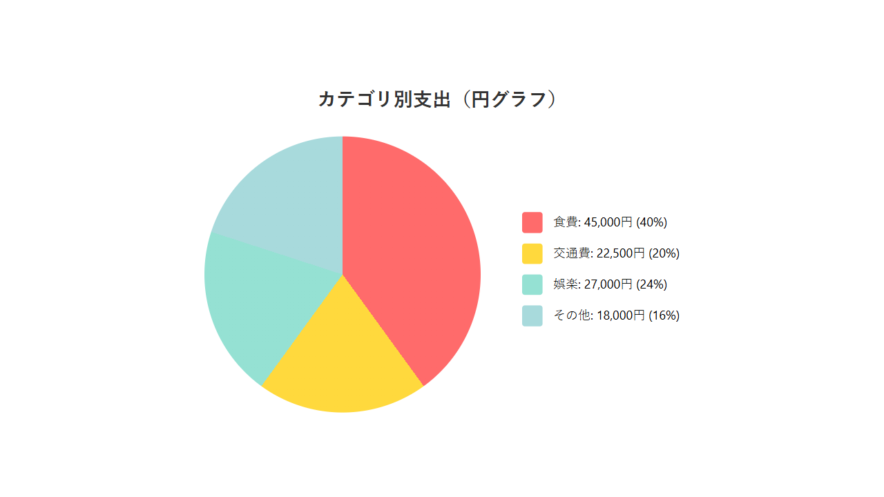
This graph makes it easy to see things like “food accounts for 40% of total spending.”
In my case, I was surprised to find entertainment took up more than expected.
Monthly Trend Graph
Select “4” to display monthly spending as a bar graph.
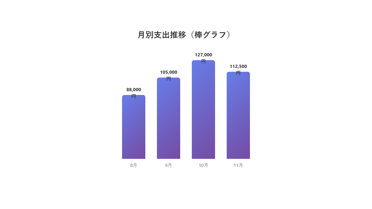
The monthly graph makes it easy to spot changes like “I am spending more than last month.”
Managing Data in Excel
Sometimes you want to analyze data in Excel rather than just viewing it in the app. That is where the CSV export feature comes in.
CSV Export
Select “5” to generate a budget_export.csv file.
Open this CSV in Excel to see data organized by date. You can use Excel pivot tables for even more detailed analysis.
Adding Useful Features
The basic features were complete, but I wanted to make it more user-friendly. So I asked Claude Code for additional improvements.
Improvement Request
Add a feature to display only this month's expenses.
Also show total amounts per category.
Claude Code responded immediately, adding a “This Month’s Spending Summary” menu item. Now I can check “how much budget is left this month” at the start of each month.
Stumbling Points and Solutions
I ran into a couple of issues during development.
Japanese Display in matplotlib
Initially, category names appeared garbled in graphs because matplotlib’s default font does not support Japanese characters. When I told Claude Code “the Japanese text in graphs is garbled,” it added code to configure a Japanese-compatible font.
Date Format
I once entered a date as “2025/11/15” and got an error. The correct format is “2025-11-15” (hyphen-separated). Claude Code also fixed this by adding input format examples to the prompt.
The Power of Data Visualization
Adding graph features really drove home the value of data visualization. Graphs are far more intuitive than plain number lists. The pie chart especially makes “which category eats the most money” instantly obvious.
The monthly trend graph also helped me realize “I have been overspending lately.”
With Claude Code, building sophisticated data visualization apps like this is surprisingly straightforward.
Summary
This time, we used Claude Code to build a budget tracking app with graph visualization.
Key Takeaways
- Record expense data and visualize it with graphs
- Category pie charts and monthly bar graphs reveal trends at a glance
- CSV export enables Excel analysis
- Claude Code supports everything from library installation to implementation
Next time, I plan to build an automated price monitoring tool for sites like Amazon.
Even programming beginners can build data visualization tools with Claude Code. Give it a try and customize it for your own needs!




Leave a Reply